An analytics minute
Histograms
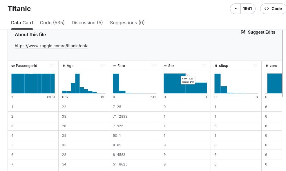
Why is it that everywhere you look, people shove these strange little bars at you? Here, for example, in a dataset description on the Kaggle platform.
First off - these strange pictures are histograms. The horizontal axis is the value of a quantity. The vertical axis is how many times that value appeared in the dataset.
These pictures are popular because they let you find out a lot of interesting things about a set of numbers with almost no effort. The simplest - the minimum and maximum value in the set. From the screenshot we see that passengerId ranges from 1 to 1309, meaning we have 1309 passengers. The second column is about age - from 0 to 80 years.
Next we look at the shape of the picture. A rectangle means the distribution is uniform. There are no standout values. And it's clear what standout values passengerId could have, when it simply marches forward in steps of 1, right?
But with age it's already different. There are few infants and old people. There are more young, middle-aged people around 27. So we see a peak around 30. The smart word for this is the mode - the most frequent value.
You can also see what kind of distribution we have - symmetric, or not so much. Age is clearly not symmetric. The distribution has a "tail" to the right. A long one. From this it's immediately clear how the median age and the mean will relate to each other. The tail doesn't touch the median, but it does pull the mean. So if you have a quantity like the average salary across a region, then besides the mean it's a good idea to look at the median too. So that the dean's salary doesn't drag the professors' salaries along with it.
#education #junior #analytics